How to Use Color in an Open Floor Plan
I’m excited to share I’ve partnered with BEHR® Paint for their BEHR Color Clinic event on April 30-May 4, 2018. I’ll be answering color questions LIVE on May 1 (1pm–3pm PST) and May 2 (11am–1pm PST) on my Instagram and on BEHR's page to help you tackle the most difficult design challenges with confidence!
Now let me show you what I did in our home! Just like as Los Angeles and New Orleans are vastly different from one another, so are the homes my heartmate and I share in each city. The houses have totally separate looks and vibes, as well as advantages and challenges. For example, our L.A. home is a little on the smaller side, but has a more open floor plan, which is a great thing in the sense that in a smaller space it can feel a lot larger, but it can be tricky to figure out how to more clearly define and unify the different spaces.
One of my favorite design tricks for transforming an open floor plan into more defined spaces is color. Y’all know I love to dab some color in my home! I love playing with and mixing colors and I’ve never been one to shy away from a bold shade. When I set out to personalize our L.A. home, I was so excited to partner with BEHR and choose from their saturated collection of Essential paint colors. We want our Los Angeles pad to be a hub for our friends and family to come over and eat, drink, and gab so it’s important for every area to be equally welcoming, but for our more formal dinner parties (you know the casual kiki spot is on our newly spruced up patio) we wanted to create a bold and dramatic dining room.
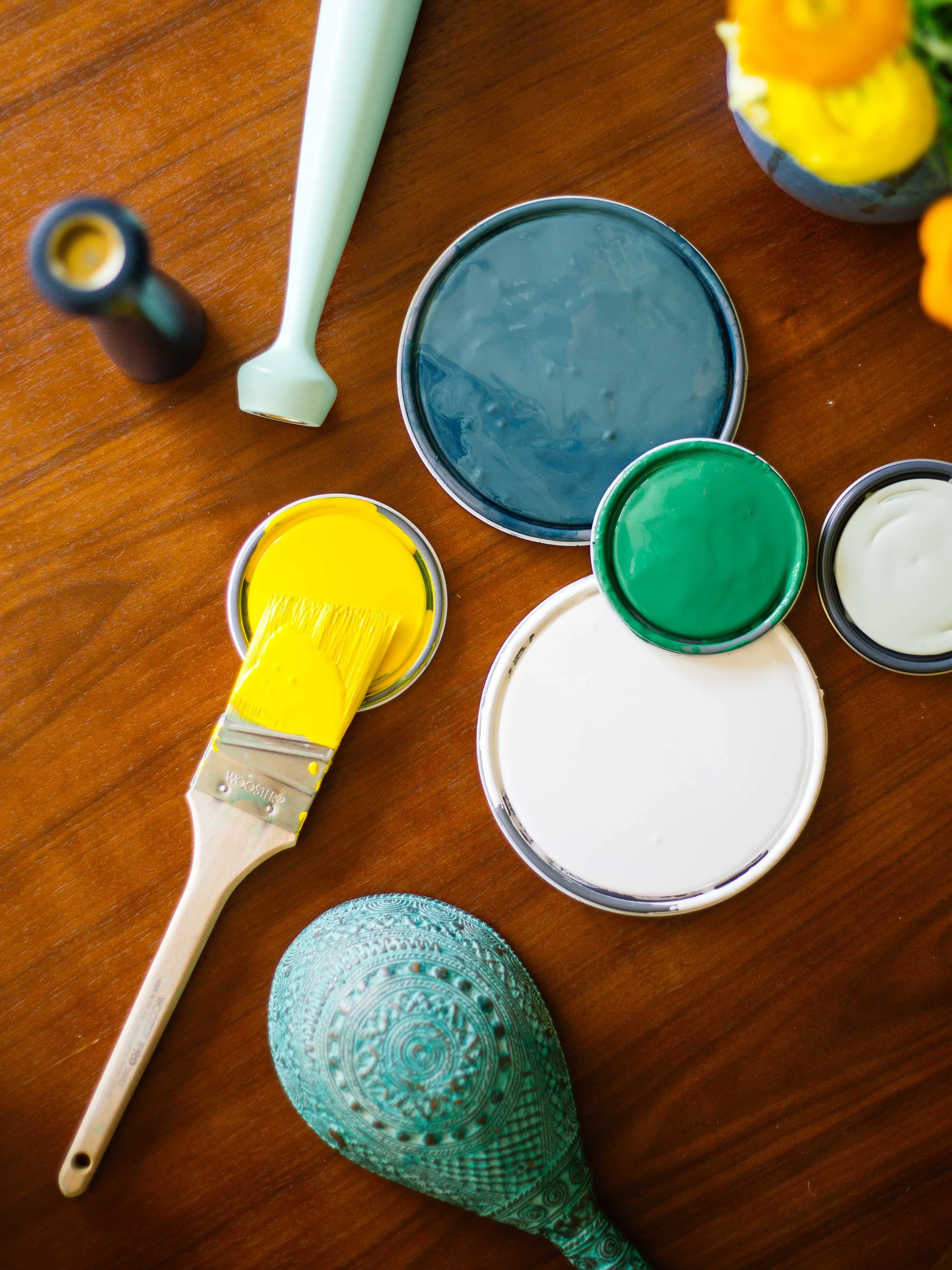


I started out by creating my BEHR Essential color palette: deep teal (Underwater), Kelly green (Grasslands), creamy white (Polar Bear), sage green (Copper Patina), and a sunny yellow (Yellow Groove). BEHR also has really helpful tools on their site where you can apply different paint colors on different walls in various rooms to see how it might look in your own space. It's pretty fun.
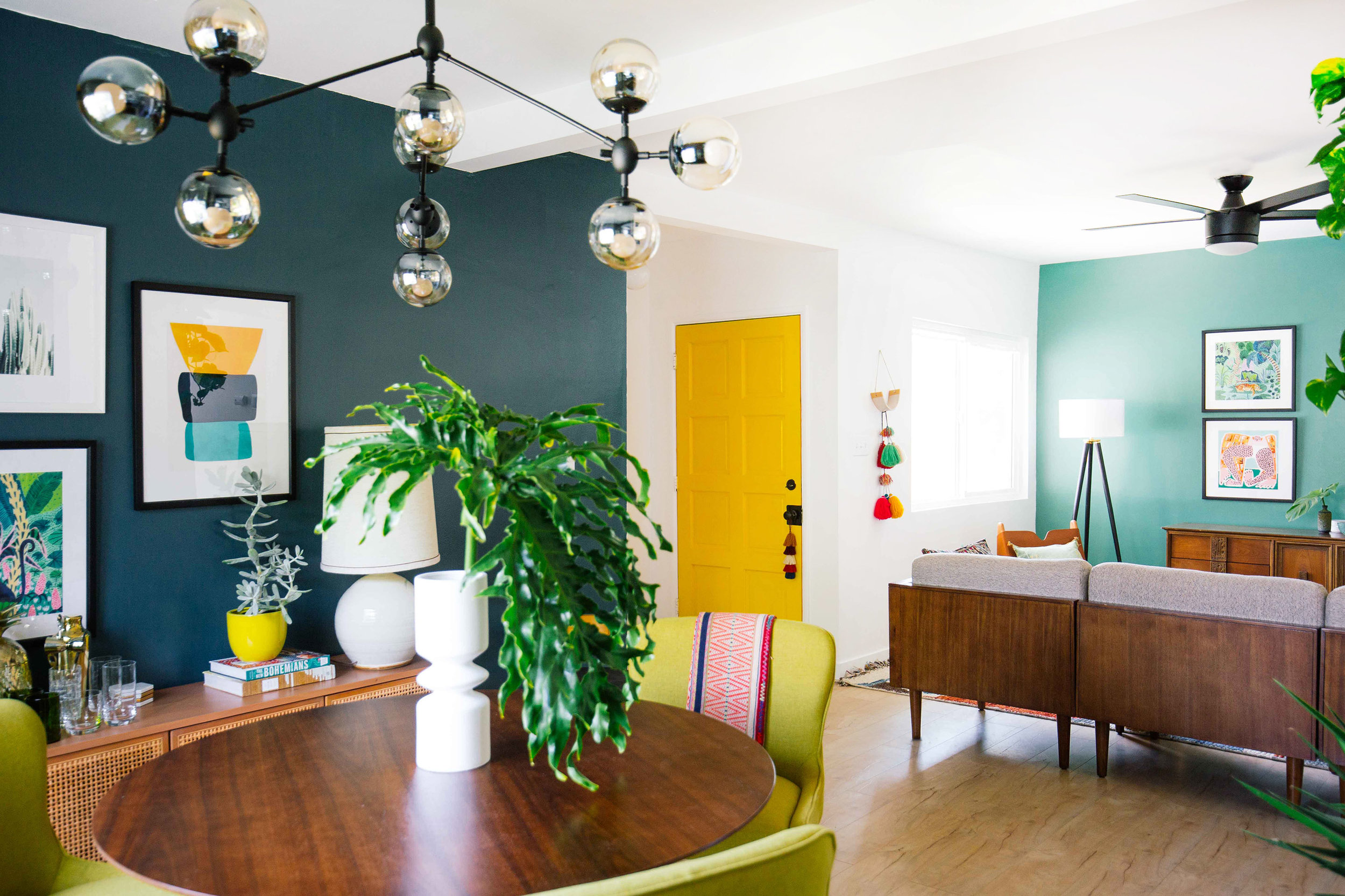
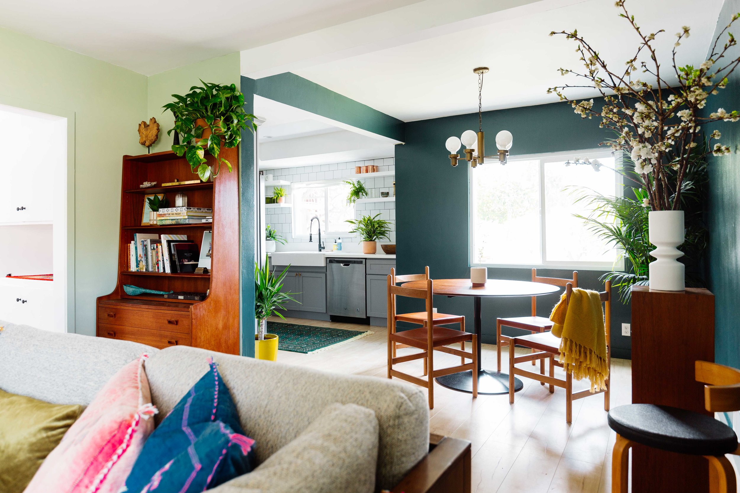
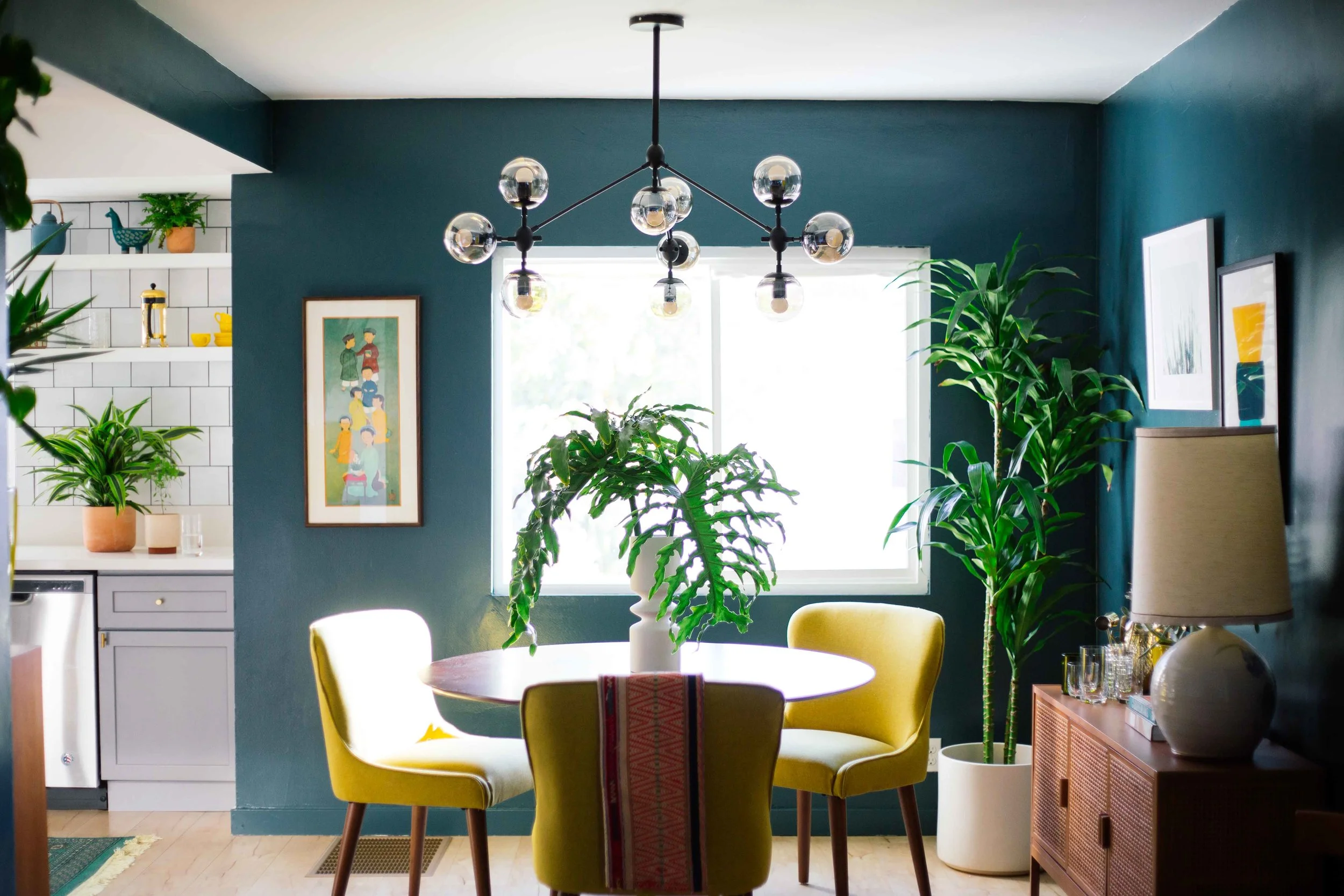
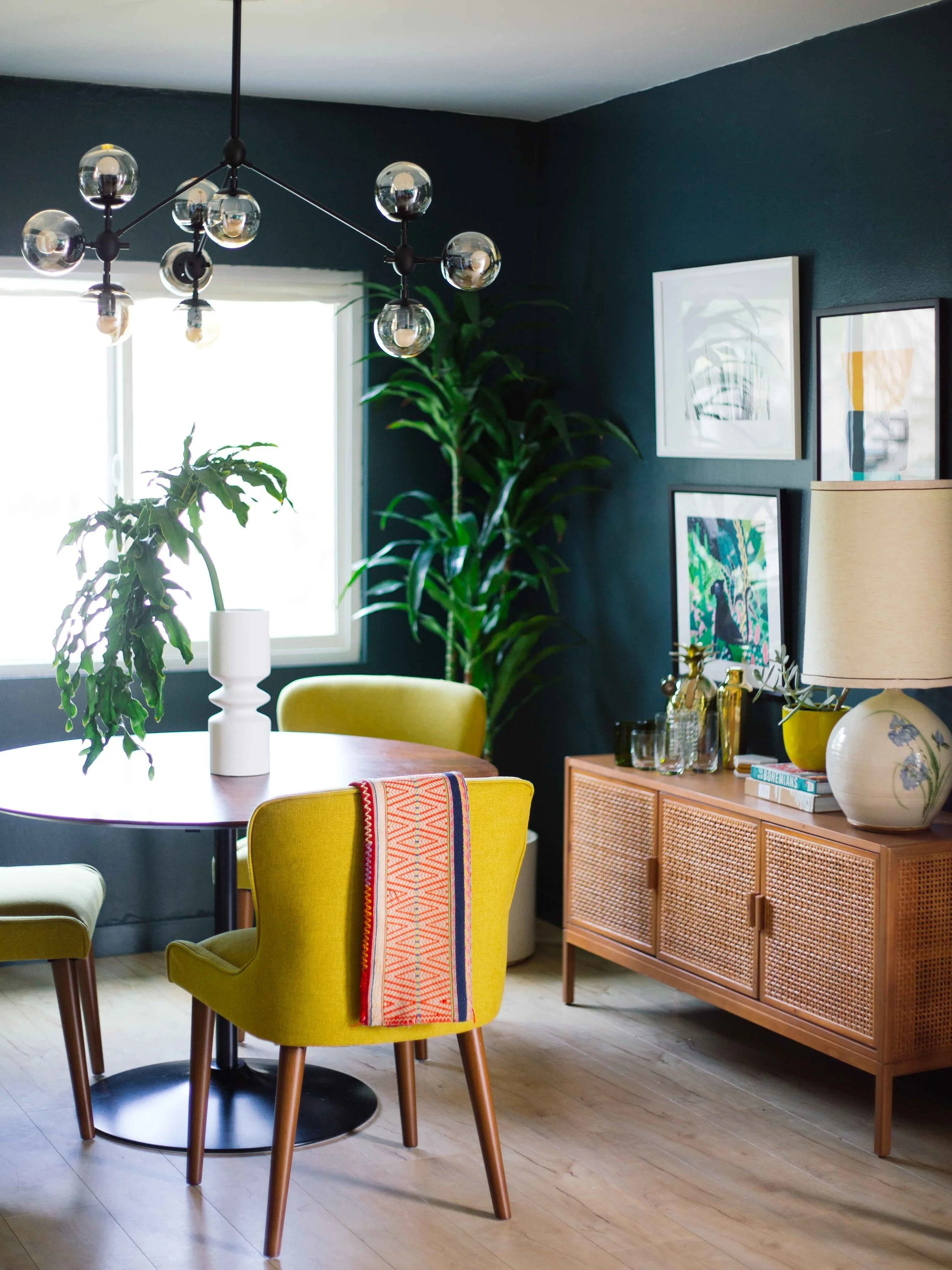
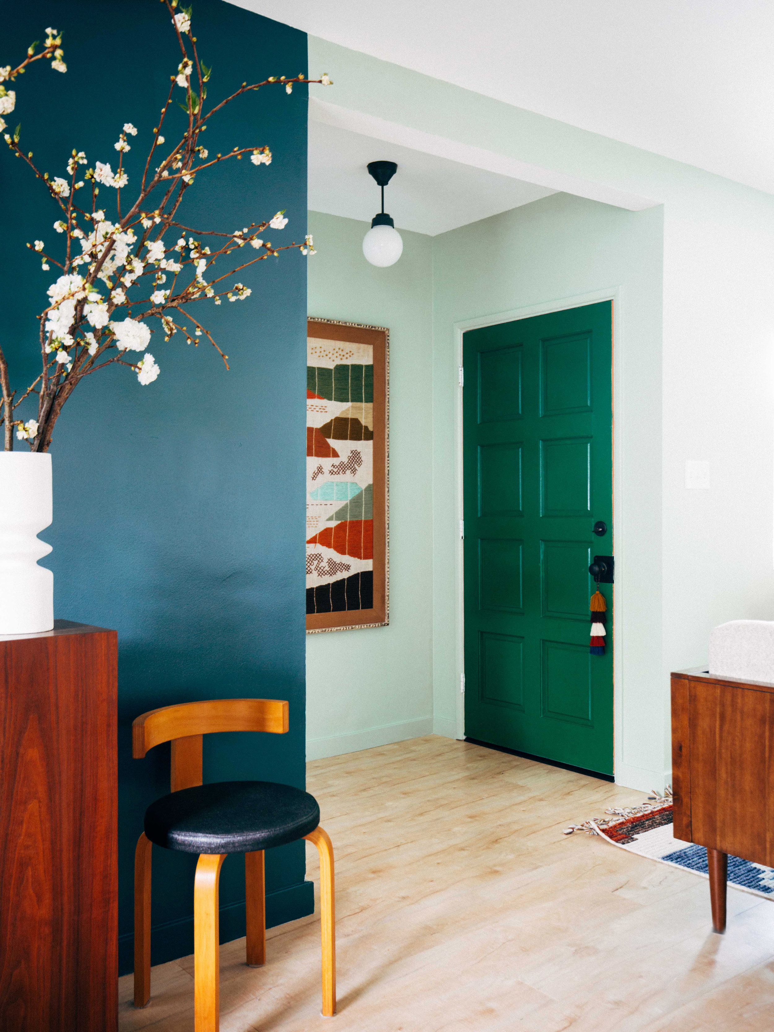
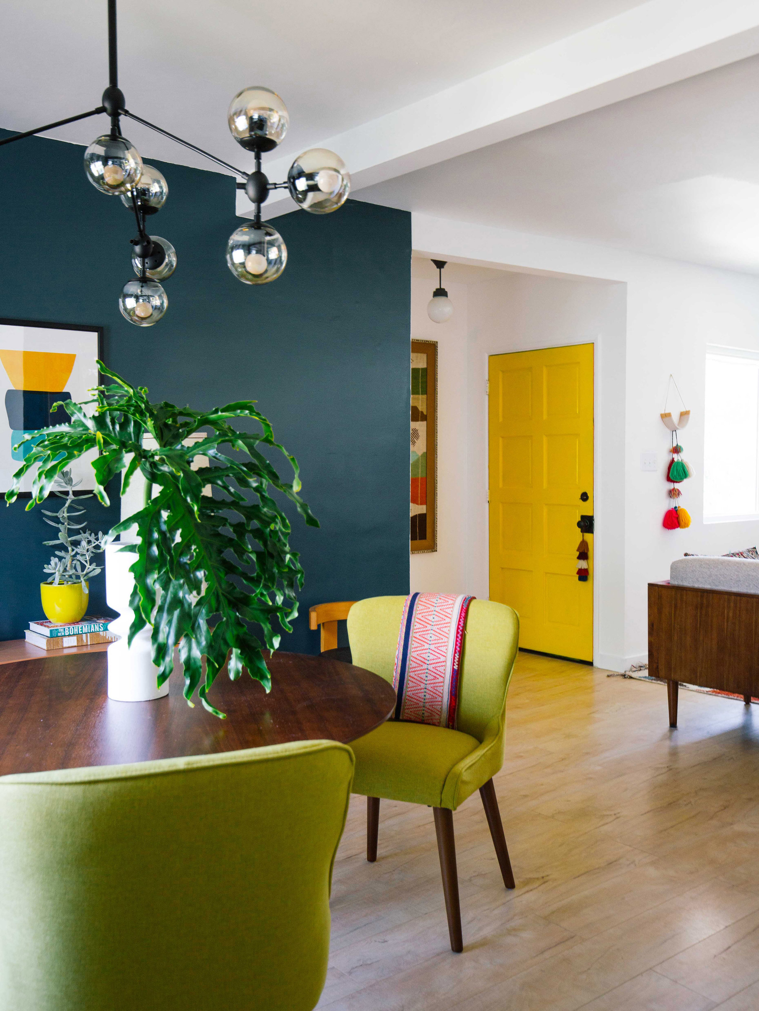
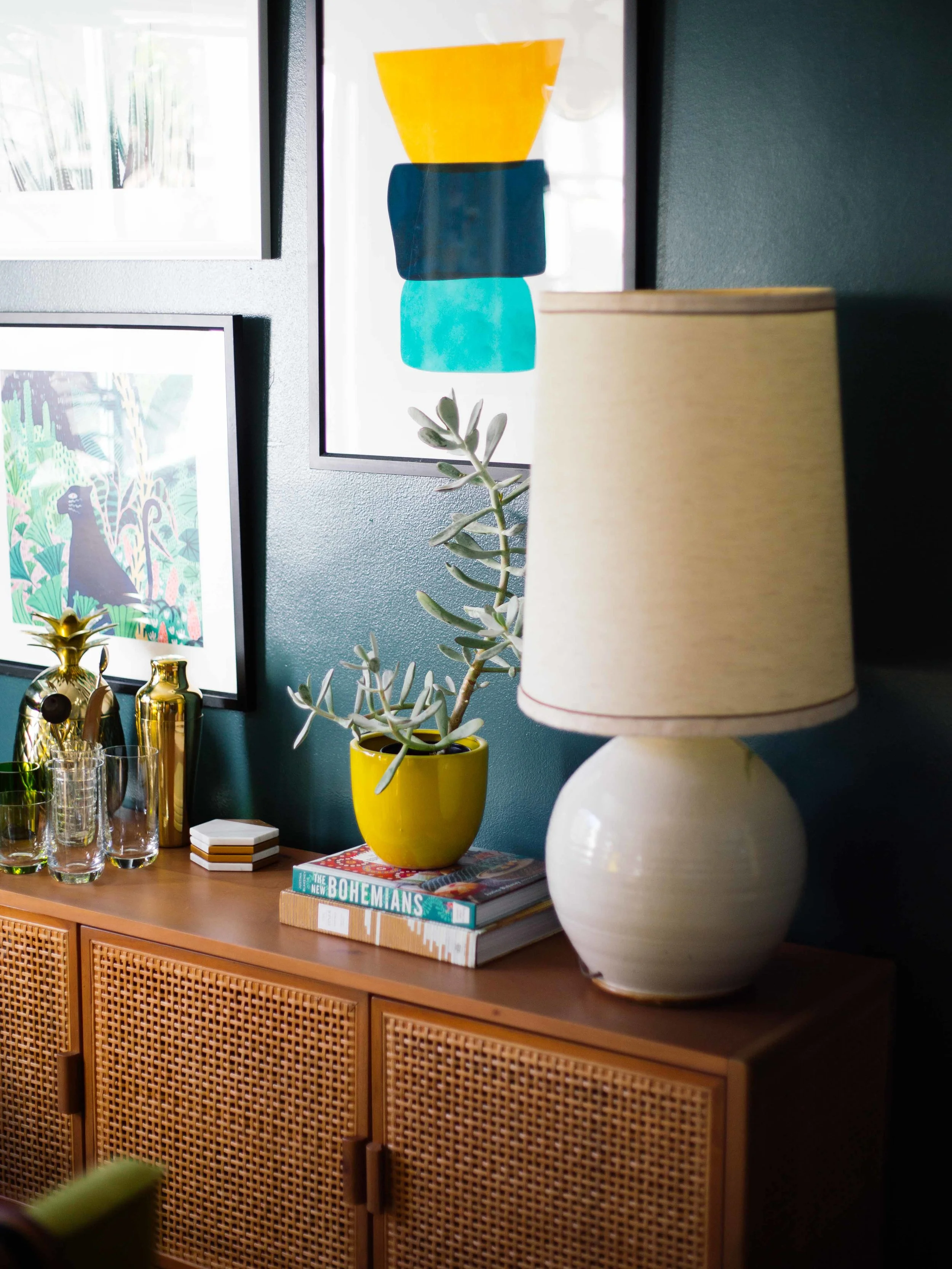
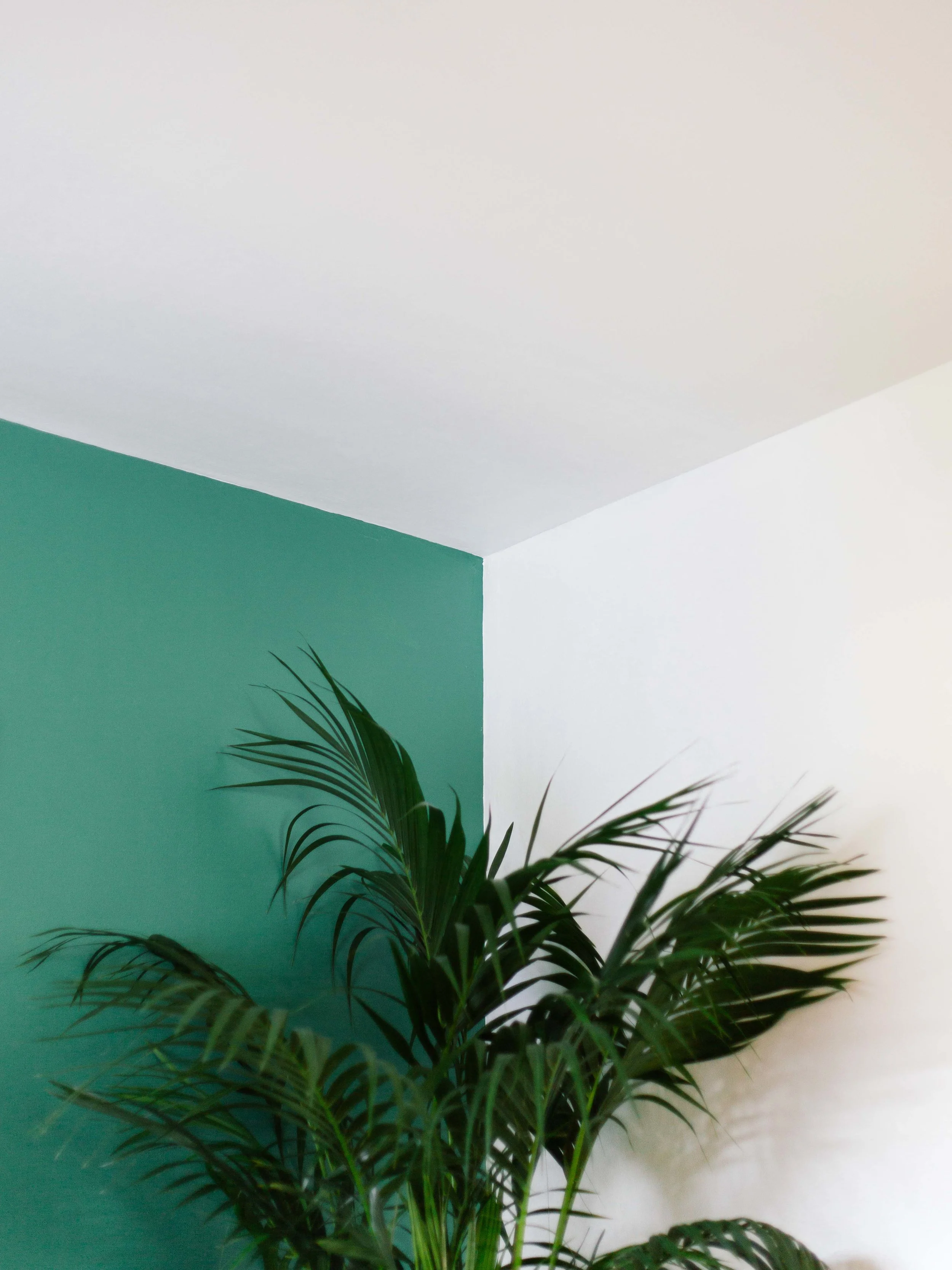
My initial goal was to try to use all the paint colors in my color palette but I might have bitten off more than I could chew! I used Underwater in a satin finish to define the dining room because it felt so elegant but very dramatic since it’s a pretty dark color. When it comes to finishes, satin is my default for all rooms. It has a very subtle shine. It's just easy to maintain as well. Our Mid-Century style furniture and accents really pop against the walls. Contrastingly, I used Copper Patina for the walls of the living room, which makes it feel more relaxed, serene, and comfortable — who’s about all those vibes in their living room? I then painted Grasslands on the door in a semi-gloss, and I was happy with how both green shades played against each other. As for the white, it made the perfect ceiling color, as it unified all the spaces.
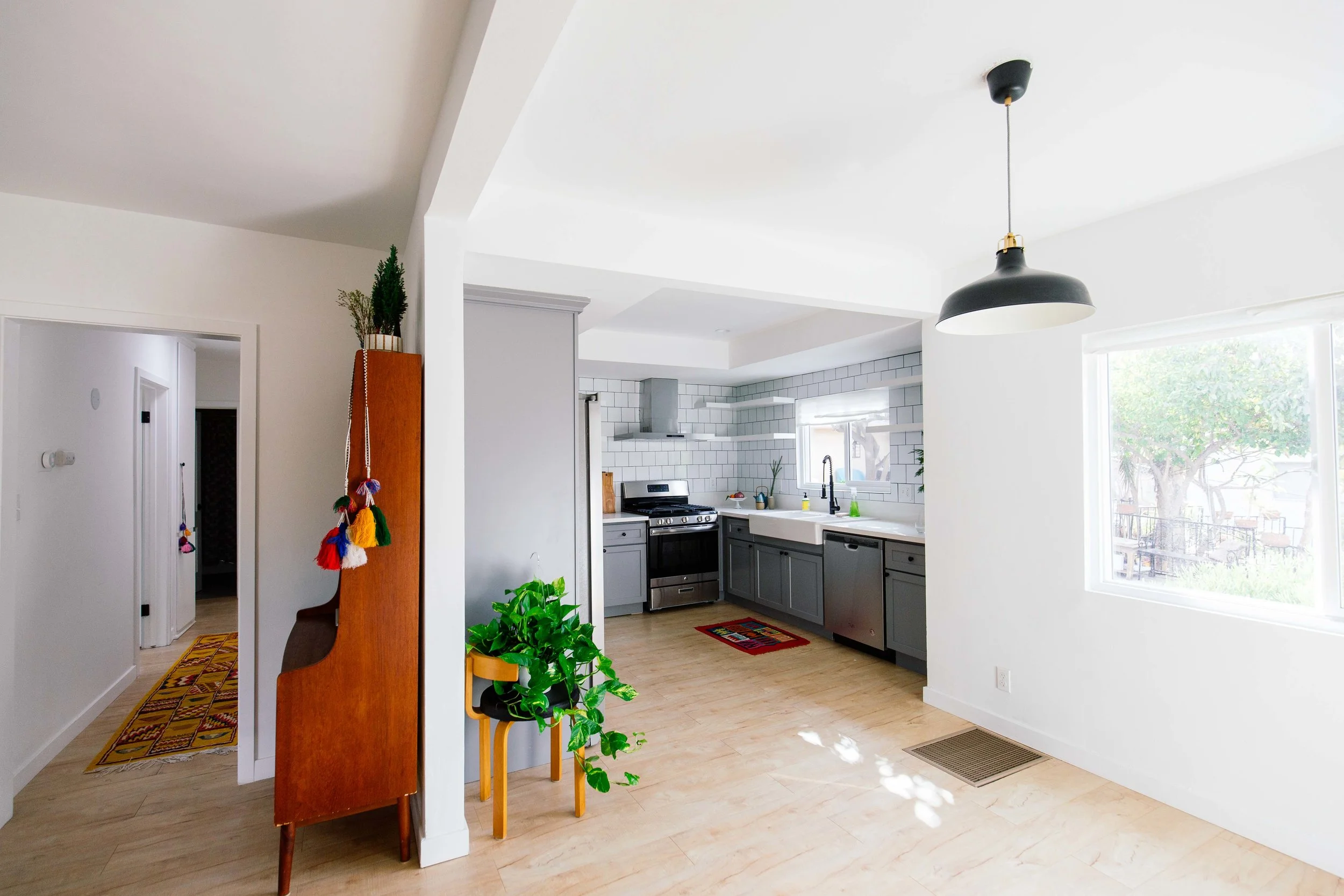
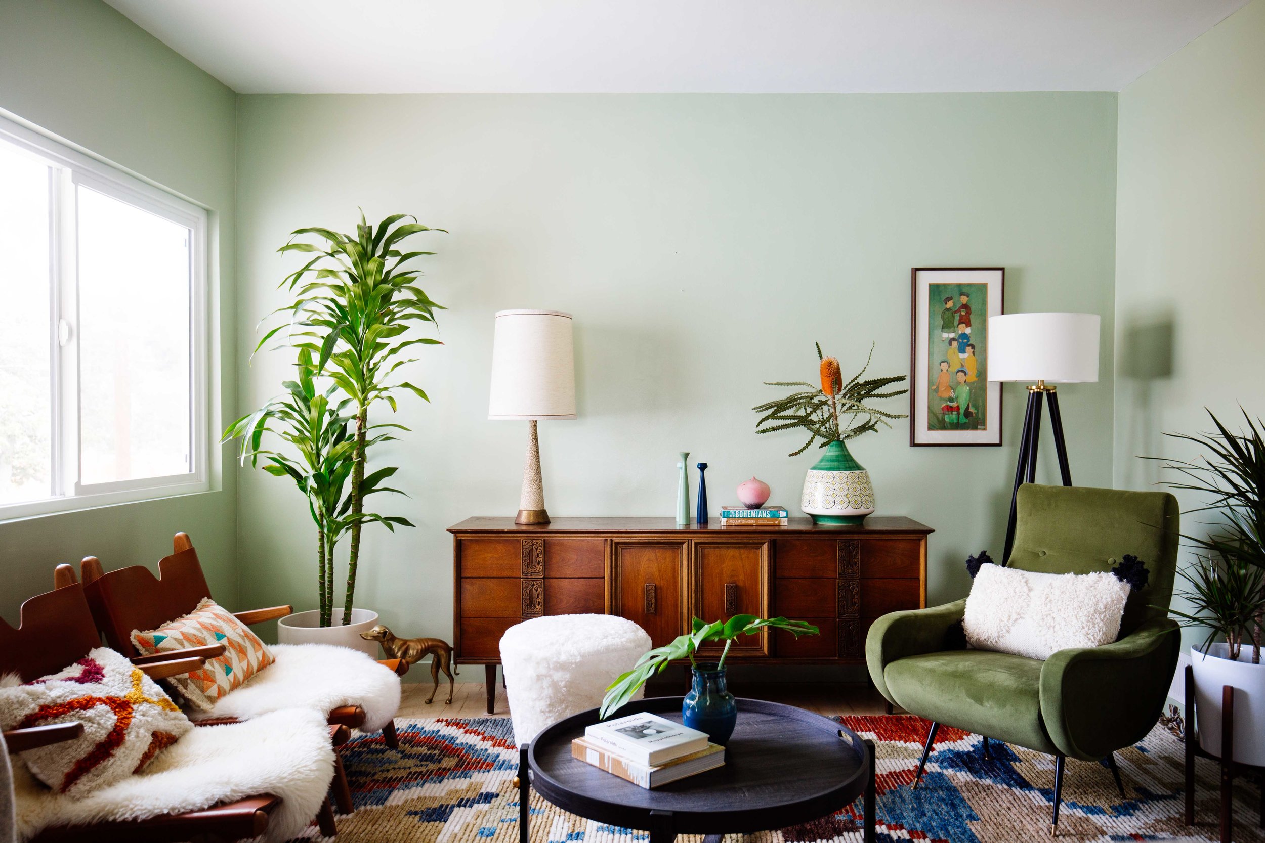
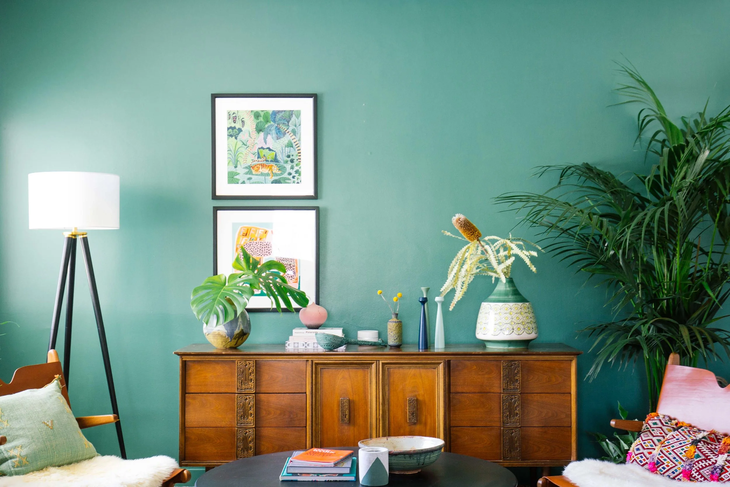
But here's the thing with paint, even after you think you picked the right color after testing it out, it can still turn out very different. I decided that painting the entire living room in the Copper Patina was competing with the dining room, so I painted the living room back to white in Polar Bear. It's a really nice, crisp and creamy white with just a hint of warmth to it.

Way better now. The bold, deep teal color needed some white to to let it breath. I also added a new chandelier and dining chairs with more weight to them. This might be my favorite room!
Here's the living room in the Copper Patina. I actually think it looks okay in this photo but it still needs a bit more contrast.
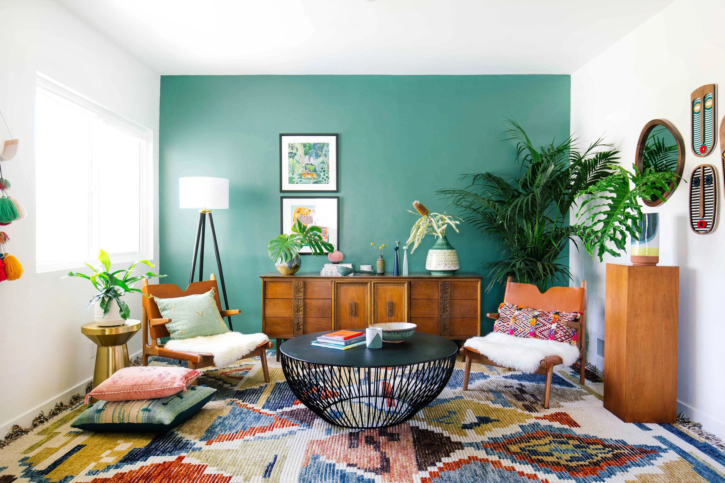
And bam! I still wanted an accent wall in here to carve out this living room space so I picked out Dark Jade and I love it! It balances out the dramatic color in the dining room.
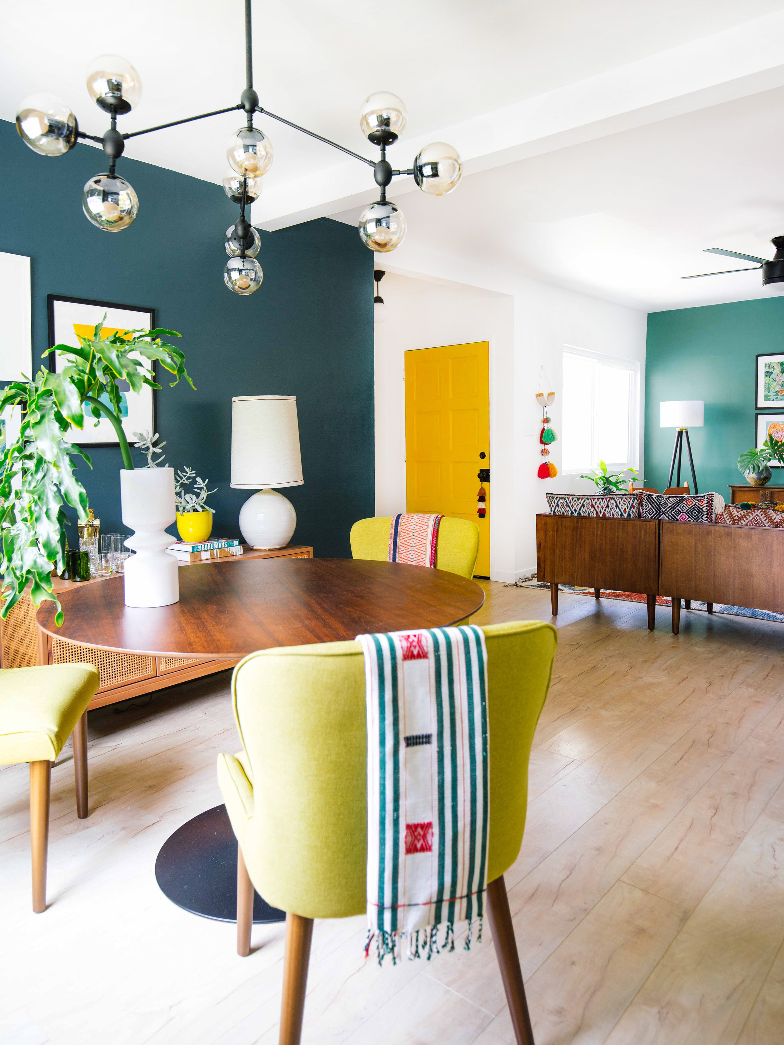

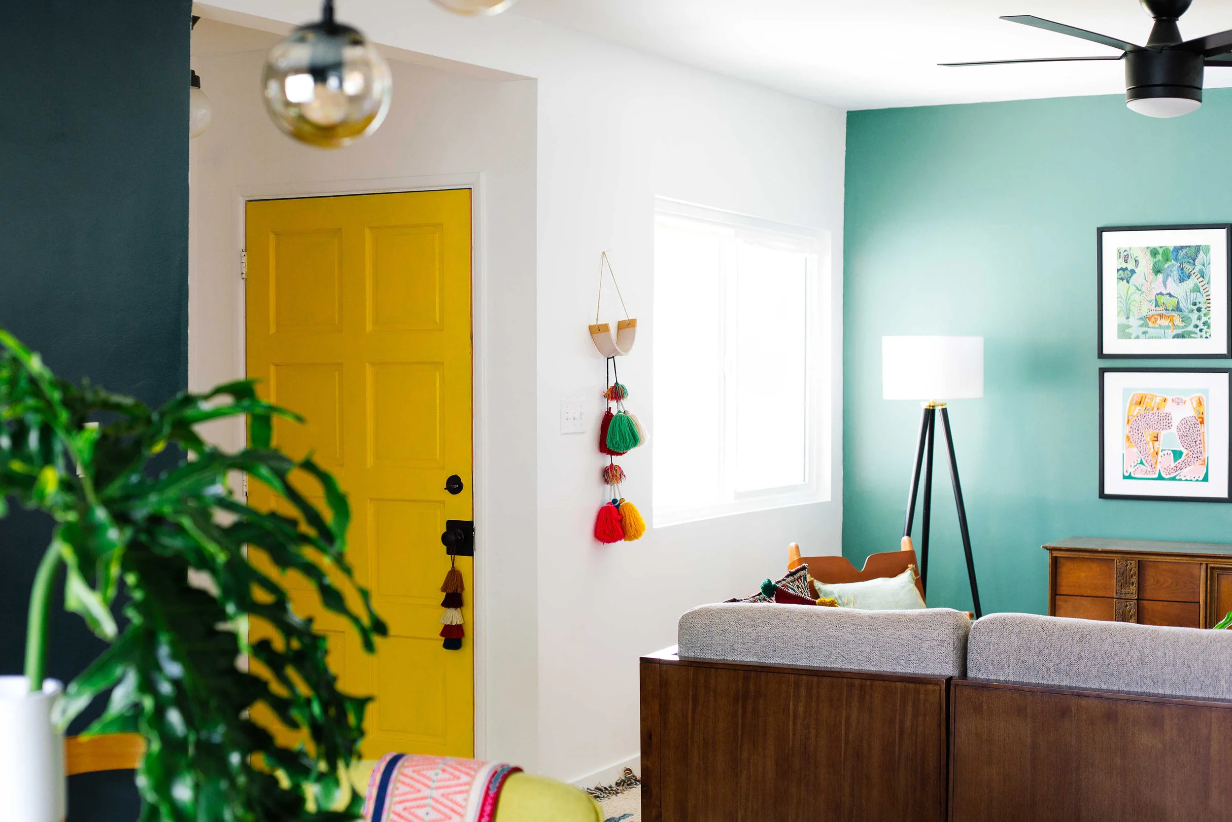
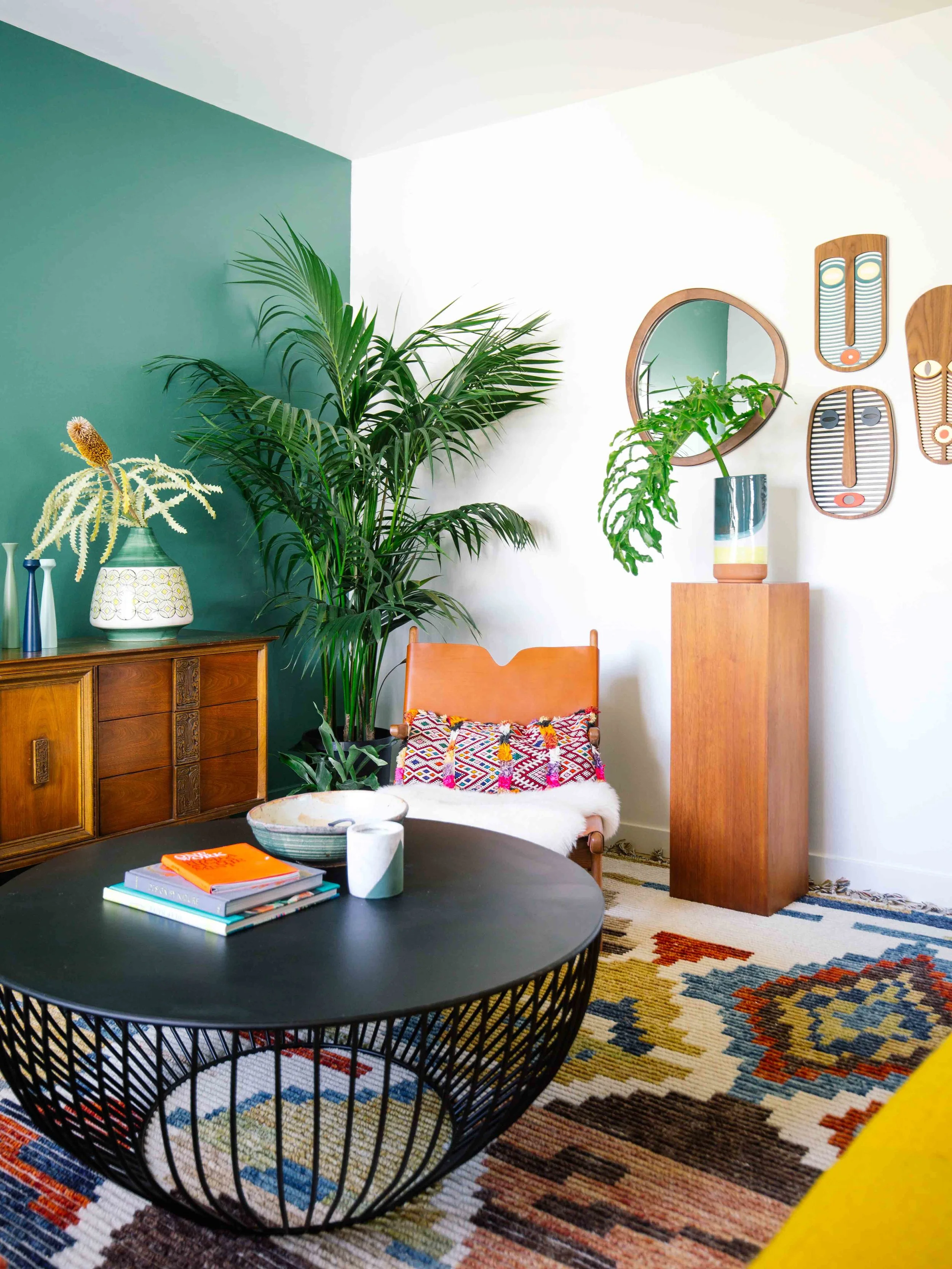
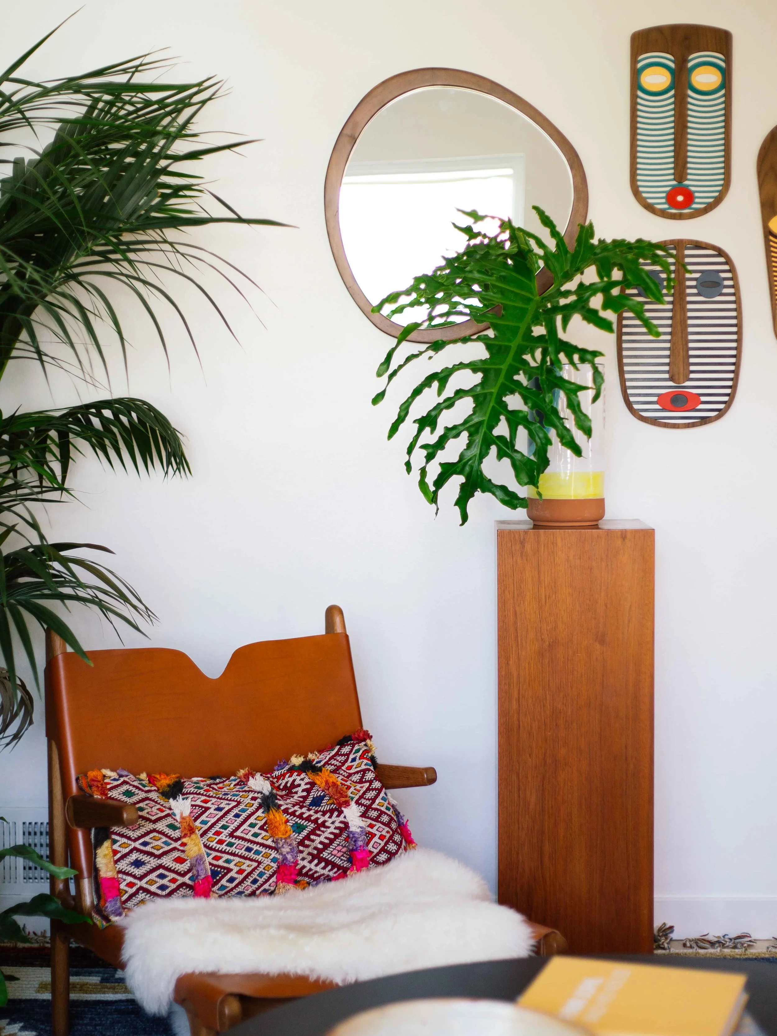
The result was even more defined and unified than I could have hoped for! I sprinkled some darker accent pieces, like a rug in the kitchen, and pillows in the living room to make it all cohesive. With the added drama and personality these BEHR paint colors provide, I’m so excited to entertain in each nook. I highly recommend playing with paint if you have a similar challenge with your home — or even if you don’t! That’s kind of the beauty of working with color; the possibilities are endless. And it's okay to paint and repaint. Sometimes, it takes a few tries to get the color just right, like my front door for example. Our home in New Orleans has a green door and it looks great so I wanted to bring that to our LA home and after awhile, it didn't sit right to me so I painted it yellow (BEHR Yellow Groove)!
Open Floor Plan Design Tips
For open floor plans, try painting a bold color in a space like a dining room to help distinguish it from other spaces. I also love to paint a bold accent wall to create a focal point and define a space.
Since I painted my dining room a dark teal, a great way to unify all the different spaces in an open floor plan is to sprinkle dark-colored accent pieces, like a rug in the kitchen and pillows in the living room, to make it all cohesive.
Try painting the baseboards the same color as your walls, especially when you have a low ceiling. This will help maximize the height of the walls. And if you’re super bold, paint the ceiling as well to create a greater effect.
Don't forget to join me at the BEHR Color Clinic event where I’ll be answering color questions LIVE on May 1 (1pm–3pm PST) and May 2 (11am–1pm PST) on my Instagram and on BEHR's page. You'll also be entered for a chance to win $500 and a professional design consultation.